
Our A/B Testing Offers Evidence that Bottom Mobile Navigation Menus are the Future
Dec 13, 2021
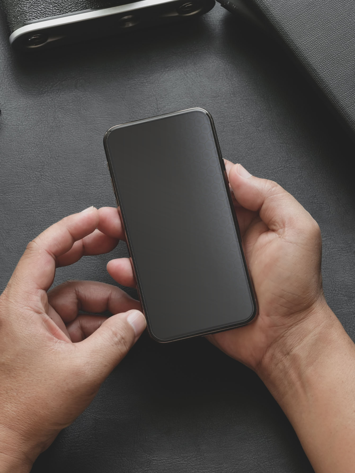
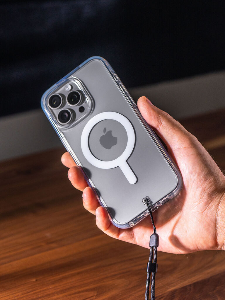
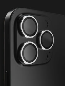
Like any e-commerce company, BodyGuardz wants to give our customers the best possible experience exploring our site. And like a lot of websites, more of our traffic is mobile than desktop. As an industry leader in phone cases and screen protectors, we’re always thinking about how people use their phones. Mobile navigation is something that’s near and dear to our hearts. Our phone cases are designed with a slim profile and ergonomics that empower our customers to use their mobile devices for longer periods of time without hand or wrist pain.
More than just our physical products, we thought we could extend this ergonomic design to our mobile menu navigation by going with a bottom navigation bar that would allow users to easily navigate our site without overextending their thumb. We then created an A/B test to determine if our hypothesis was correct. Our results, which we’ve decided to share here publicly, offer evidence that more websites should consider switching to bottom mobile menu navigation.
Observations and Hypothesis
We noticed when researching our hypothesis that several mobile apps used a bottom navigation bar, but very few mobile sites had made a similar change. Thus, one of our assumptions was that most users would have some experience with a bottom navigation bar but would still be more accustomed to the top menu navigation bar.
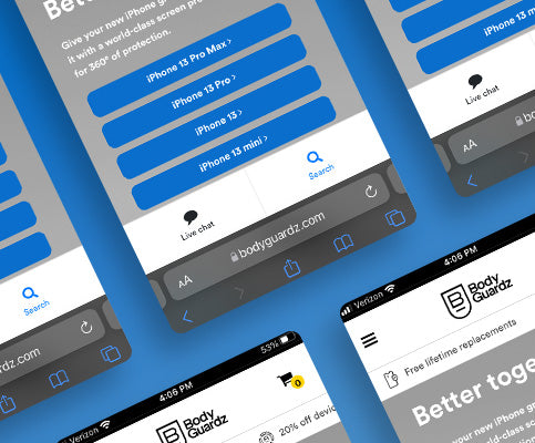
Our hypothesis was that our users would find it easier and more comfortable to navigate our site with a bottom navigation bar--and that this would lead to increased engagement overall with the site. So, we set up a relatively simple A/B test to measure the engagement for our control and challenger mobile navigation. Here is what our mobile site looks like with a bottom navigation bar:

Experiment and Results
We ran our test for a period of 4 weeks from the end of May through the beginning of June. We sent half of our mobile traffic into the control group with the traditional top menu navigation and the other half into the challenger group. What we discovered was both expected and surprising at the same time. We saw huge improvements in our click-through rate for our Search menu and Live Chat feature. At the same time, fewer visitors used the top navigation hamburger menu to explore our site.


The real test was how many of our visitors made it to our Shopping Cart page with each setup. Here, the results weren’t as dramatic with increased engagement of 3.3%. Still, it was a clear win for the bottom navigation set up. For every 20,000 visitors to our site, that's an extra 660 people who reach our Shopping Cart page with comparable performance in overall sales.

Consumer Research and Smartphone Finger Pain
According to research from Tristen Denyer, 85% of smartphone users hold their phones in one hand, with closer to an even 50-50 split for scrolling with their thumb or finger. Both constant pressure and repetitive movements can lead to smartphone hand pain with the thumb and pinky finger most commonly affected, according to Healthline. There is even an interactive guide that can help you determine the optimal phone screen size depending on the size of your hand. That said, you can definitely use a bigger phone more comfortably when using an app or browser with bottom navigation.
Apple Makes the Move to Bottom Navigation for Safari
The new iOS 15 includes several updates aimed at improving the Apple user experience. One of the biggest changes is a default setting to bottom navigation for the Safari web browser. This has created strong opinions among many Apple users. If you simply can’t stand the bottom tab bar, there are relatively easy ways to reset Safari to a top navigation setting. Still, we suggest you give the new navigation a fair shot. After getting over any initial awkwardness and lack of muscle memory, your fingers and wrist are going to start thanking you. For those who have struggled with smartphone hand pain or repetitive stress injuries in the past, the decision should be a no-brainer.
Conclusions and Next Steps
We’re glad we were able to create an easier and more comfortable way to explore our mobile site, and we’re a little proud that other websites and platforms are following the same trend. Now that we’ve optimized our mobile site for a better user experience, we’re going to continue on with our core mission to deliver the best smartphone cases and screen protectors available today.


Leave a comment
This site is protected by hCaptcha and the hCaptcha Privacy Policy and Terms of Service apply.